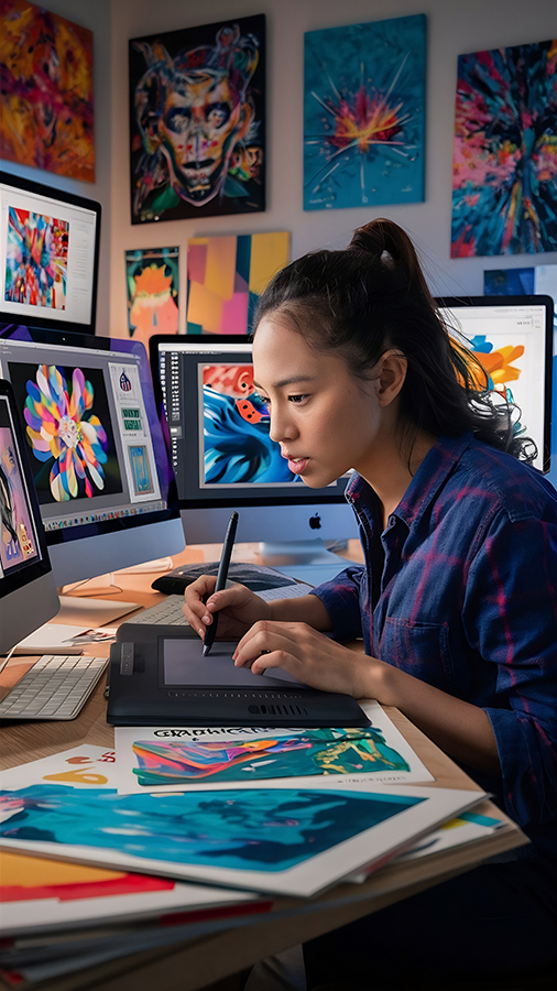
Posters are one of the most commonly used visual media in schools—from competition announcements, art performances, student council activities, to class campaigns. The good news is, you no need to be a design expert to create an attractive poster. With these simple tips, you can create a neat, informative, and definitely cool poster!
Source Freepik.com
1. Determine the Purpose of the Poster
Before starting the design, think first:
- What is the poster for? (competition, event, appeal, important information)
- Who will see it? (classmates, the whole school, teachers, or the general public)
- What style of design would you like? (fun, formal, youthful, sporty, etc.)
A clear objective will make it easier for you to determine the colour, shape, and text content.
2. Use Attractive and Large Headings
The title is the first thing people see.
Tips:
- Use the largest font size.
- Keep it short and easy to understand.
- Use attention-grabbing words, for example:
- “Come on, follow…”
- "Important Announcement!"
- “Register Now!”
3. Choose the Right Colour Combination
The right colours can bring a poster to life.
Use:
- Only 2–3 main colours (so it doesn't look messy).
- Contrasting colours, such as:
- Blue + Yellow
- Black + Orange
- White + Dark Blue
Ensure that the text remains easy to read.
4. Use Relevant Photos or Illustrations
A poster without pictures will look boring.
Use images that support the event, for example:
- Image of a ball for a futsal competition poster.
- Image of a book for a book fair poster.
- Microphone icon for singing competition.
The image quality must be clear, not blurry.
5. Arrange the Layout Neatly
Layout is very important in poster design.
Use this guide:
- Title at the top.
- Main image in the centre.
- Event information below.
- Contact details or other information at the bottom of the page.
Gunakan margin neatly and not too close to the edge.
6. Use Easy-to-Read Fonts
There are many different fonts, but choose one that is clearly legible from a distance.
Recommended fonts for beginners:
- Poppins
- Montserrat
- Bebas Neue
- Arial
Avoid using more than two types of font in one poster.
7. Note the Information Hierarchy
Important information should be more clearly visible, for example:
- Main title
- Date and place of medium size
- Small notebook
This will help people understand the content of the poster in 5 seconds.
8. Use Free Software
You don't have to have expensive apps.
Try our free, beginner-friendly design tool:
- Canva
- Pixellab (HP)
- Photopea (similar to Photoshop, free)
- Canva Education (suitable for schools)
Select a template and customise your own design.
9. Complete with a double-check
Before printing or installation:
- Check that all the information is correct.
- Ensure there are no typos.
- Ensure that colours and fonts are consistent.
- Ask your friends for their opinions on the final revision.
10. Creative But Still Simple
Too many effects just make it messy.
Prioritise three things:
- Easy to read
- Rapi
- Relevant to the theme
Simple = elegant.
Closing
Creating a cool poster is not as difficult as you might think. With the right colour choices, a neat layout, and easy-to-read fonts, you can produce attractive posters even if you are a beginner. Keep practising and exploring your own design style!
🚀 Come join SMKS TI ANNISA 2!
If you enjoy creating designs, posters, or other visual works, then you have a talent for technology and design!
At SMKS TI ANNISA 2, you can learn:
- Visual Communication Design
- Graphic Design
- Computer Networking Techniques
- Multimedia and other digital technologies
➡️ Sign up now and start your creative journey with us!
Create works, build skills, and become part of the future digital generation.